
What If Inflation Doesn’t Stop the Fed?
Scenario Analysis: What Happens If the Fed Looks Past Inflation?

Hey guys,
Markets are a mirror of discipline, they expose what’s solid and what’s fragile.
Staying grounded in process is how we turn volatility into opportunity.
Let’s begin!

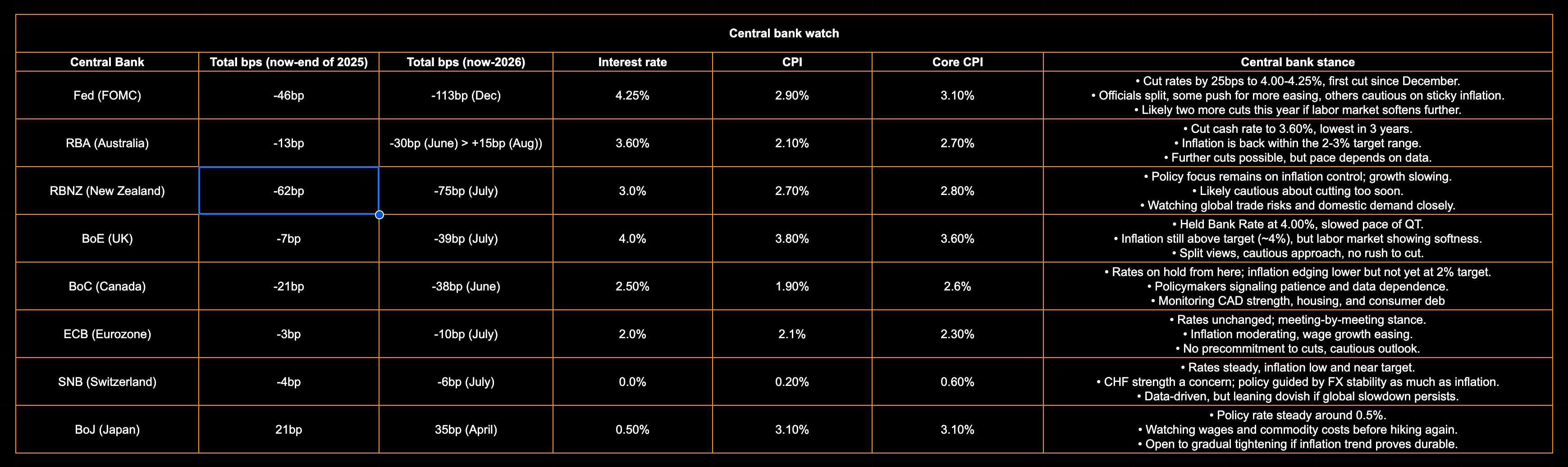
Central bank tracker
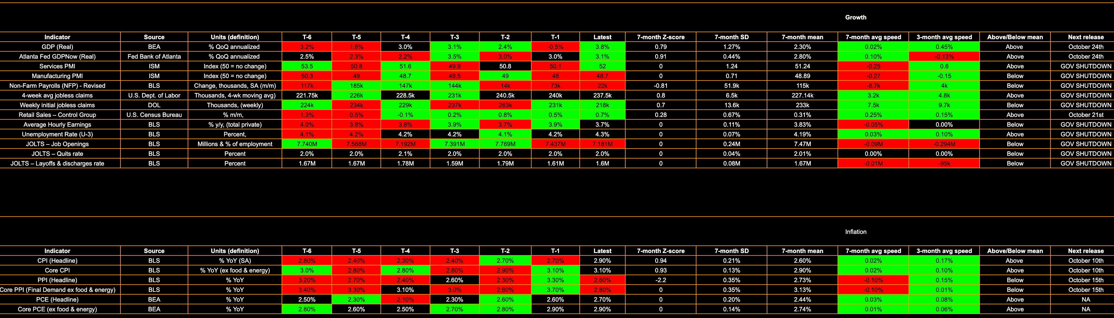
US data tracker
What if inflation doesn’t stop the Fed?
If you’ve ready my reports across the last few months, you know how my thought process is that the Fed will eventually “need to” step on the curve and be more hawkish. But like any scenario I run, I need to know my tail-risks. Theoretically, the Fed doesn’t “need” to do anything and we’ve seen that even in the face of strong inflaiton, more and more cuts are being priced. Before we get in, let’s just do a quick review on what the US is facing:
47bp of cuts priced by December 20255, 113bp by December 2026
Terminal rate of 3% to be met in the peirod between June-July
Inflation data exerting positive speed on a 3 and 6-month basis, trading above the 7-month mean in recent readings
Labor has seen a slowdown, but jobs are still being added and figures are normal based on where the hiking cycle took us. Labor is the other side of the growth coin, and growth is strong.
It’s important to not loook at makrets at face value (e.g. “equities will rally if the Fed keep cutting) because these views are not supported by context, they’re just first principles thinking. So let’s look into my take on what would really happen if the Fed continue cutting at this speed seen in the OIS curve, inflation maintains stability around current figures or even increases, while growth is strong.
The scenario
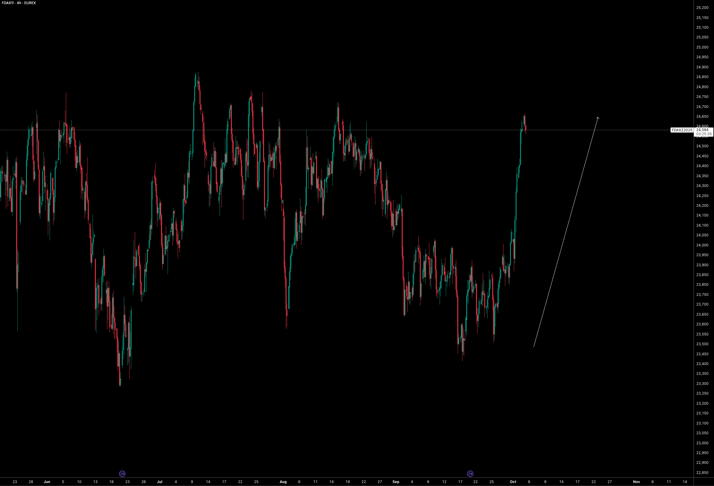
Imagine a scenario where the Fed continues to cut rates even as growth remains strong and inflation stays stubbornly high. At first, the reaction across markets would feel familiar: equities would rally as discount rates fall, valuations expand, and credit markets breathe easier. Spreads would remain tight in the early innings, giving the illusion that easing policy can coexist with a hot economy. Investors would cheer looser financial conditions, and the path of least resistance would be higher asset prices. But beneath that surface, the dynamics would begin to shift in ways that ultimately turn more dangerous. It sounds like we’re at this exact point now…
The first signs would appear inside equities themselves. Leadership would rotate away from megacap tech, with small caps and cyclical sectors beginning to outperform. Small-cap’s and tech’s relative charts would act as an early warning system, flagging that the easy liquidity rally is already maturing. At the same time, inflation expectations would grind higher. Breakevens would widen, and near-dated inflation swaps in the 2y-5y part of the curve would start pricing closer to 4% rather than 3% (currently both trading around 3%). This would be the market’s way of saying that inflation is no longer just a temporary annoyance, but a persistent feature of the cycle.
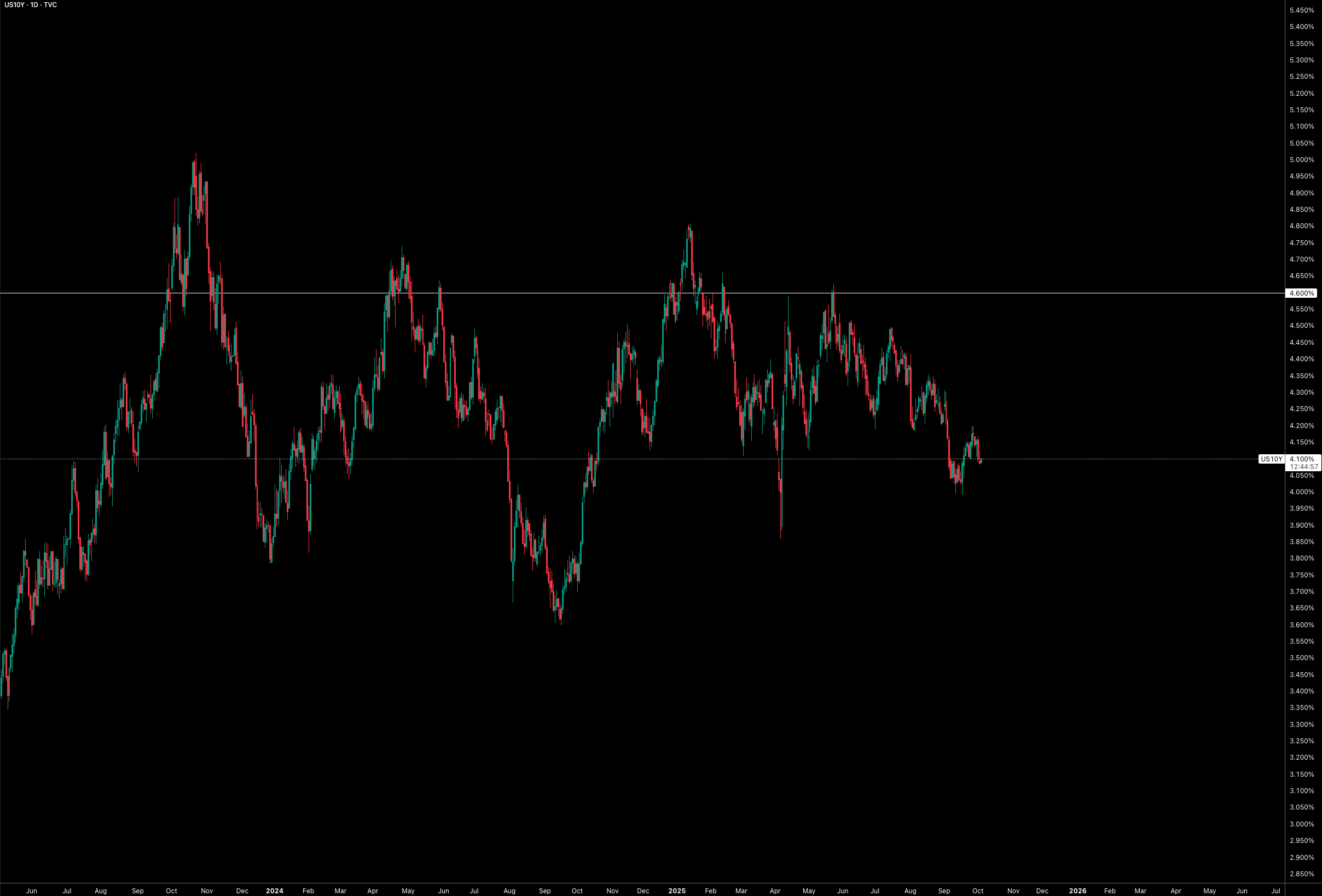
As that realisation sets in, the long end of the Treasury curve would begin to assert itself. The 10y would push up toward 4.6% or beyond, dragging term premium higher and putting pressure back on equities. For a time, credit spreads would remain tight, because investors rarely rush to widen spreads while growth is still strong. But once inflation begins to drag on real growth and corporate margins, spreads would finally give way. By then, equities would be facing a double hit: valuation pressure from a higher long end, and earnings pressure from rising costs. The honeymoon would be over. It’s definitely not foreign for the 10y to see 4.6%+.
The inflation feedback loop could intensify this process. With growth strong, oil prices could fly, feeding directly into headline inflation and then leaking into stickier components like wages and services. That would create a self-reinforcing cycle: higher inflation pushes up long-end yields, those yields hurt valuations, and higher input costs weigh on corporate profits. At first, the market would interpret rising oil as a sign of robust demand, but soon it would become another tax on growth. Once this shift takes hold, the rally that began on the back of Fed easing would lose its foundation.
At that stage, capital would begin to rotate globally. The US, weighed down by an overextended long end and sticky inflation, would start to look less attractive. Europe would appear in a more sustainable place, not because it is a haven, but because its equity mix is less duration-heavy and valuations are more balanced (for now). Flows could leak into European markets, providing relative support for the euro even as the US experiences stress. Meanwhile, emerging markets would struggle. Higher US yields and stronger oil prices would be a double hit for many EM economies, raising funding costs and importing an inflation tax through commodities. In such a world, short EM becomes a safety play while long Europe offers relative shelter. We could already be seeing this early rotation as European equities have been outperforming US equities this week (broadly):
The cross-currency space would also react sharply. XCCY swaps would likely drop as funding stresses emerge and balance sheet constraints bite. A more negative basis in EURUSD/USDJPY would signal that dollar funding is once again commanding a premium, reflecting the strains created by a long-end blowup and persistent inflation. That would be another layer of pressure reinforcing the global rotation into safer developed equity markets and away from more fragile EM risk.
Through all of this, the cleanest and most straightforward way to express the macro view would be a steepening of the US curve (which is a trade I’ve been running across many months, shared in reports). When things seem too straightforward it eels “too easy to work”, but when it comes to the steepner, that idea breaks. Cuts at the front end pull 2y, while sticky inflation and rising term premium push the 10y higher. The 2s10s steepener becomes the anchor trade, capturing both the early honeymoon and the eventual repricing. Around that core, investors could layer in inflation trades through 2y-5y five-year swaps (although this isn’t for a retail investor), tactical oil exposure as part of the inflation feedback loop, and relative equity expressions such as long Europe versus the US, or short EM beta where external funding is most fragile. Below is the 2s10s trade sent out in the Substack chat. Had a few running across the months but this is the only active right now.
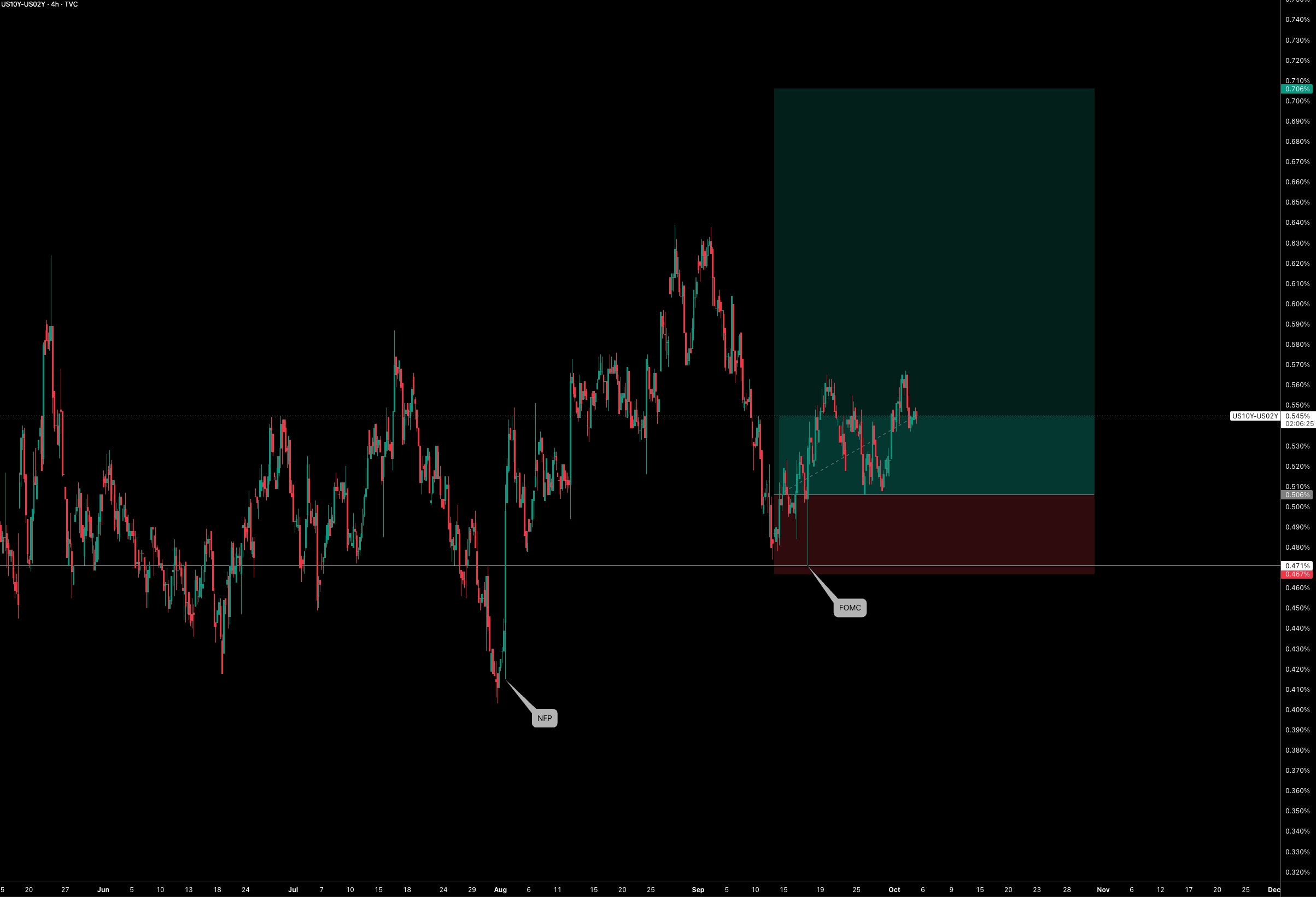
The sequence is straightforward. First, markets celebrate the Fed’s generosity. Then, small caps and tech rotation show the leadership is changing. Next, the long end blows out, inflation swaps reprice toward 4%, and oil strength intensifies the loop. Finally, capital rotates globally, with Europe the relative winner and EM the clear loser. Along the way, credit spreads lag the story until margins are squeezed, but once they widen, the equity rally is decisively over. The dashboard for tracking all this is equally simple: 2s10s slope, 10y yields approaching 4.6%, inflation swaps above 3%, Russell versus SPX leadership, HY spreads, Europe versus US equities, EM beta, and the cross-currency basis.
The bottom line is that cutting into heat buys time, but not peace. The Fed can create a front-end party, but the long end eventually calls the bluff. Inflation does not just coexist with growth, it eventually drags on it. Oil accelerates the cycle. Europe becomes the relative beneficiary, while EM pays the price of tightening global conditions. And through it all, the curve steepener remains the purest, cleanest expression of the regime.
Guys, have a great weekend!