
Trading The Yield Curve: Pt 2
Beyond the Basics: Unveiling the Nuances of the Yield Curve

Hey crew,
This report was meant to go out last night, so thanks for your patience!
You’re all due for a life update, will be back next week to fill you all in.
Last week we delved into the different properties of the yield curve— today I want to go slightly deeper into more nuanced features of trading the curve and the different pieces of knowledge one must have not just for trading the yield curve but for fully grasping the global macro trading universe.
Before we do such, let’s take a look at the macro snapshot, thought of the week and chart of the week with you all.
The Macro Snapshot
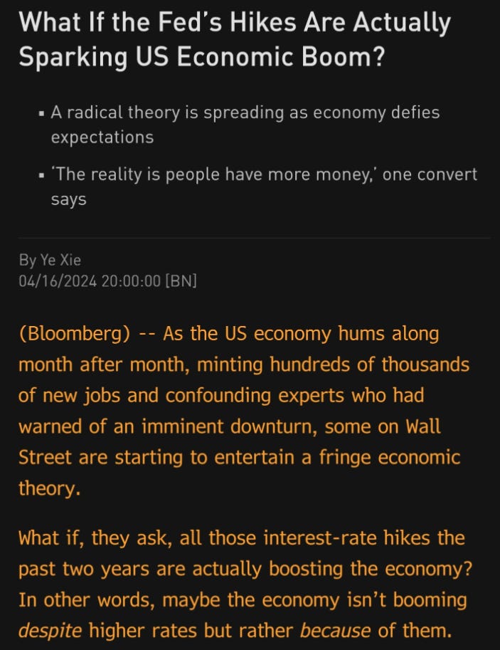
What happens when you front-run policy cuts and then get hit by an influx of policy-opposing data?
You get a bullish dollar.
Last week hotter than expected inflation data pushed expectations of a 3/4 rate cuts down to markets now debating over the potential for a single cut. A strong retail sales print, 1.1% vs 0.5% consensus added fuel to the fire helping the dollar maintain its rally of c.5% YTD.
As expected, the basket of EM currencies start to suffer in the light of a stronger and persistent dollar.
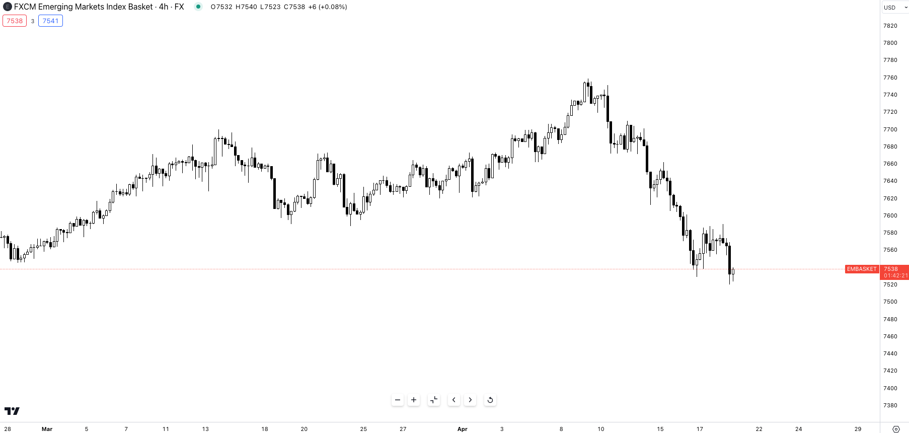
Despite the lack of concrete plans for rate cuts, the FX market is already reversing its earlier assumption of aggressive easing. Futures markets now predict a 45% chance of a cut in September, followed by a pause on further reductions until 2025.
Thought of the Week:
An argument many followers of MMT (Modern Monetary Theory) have become well acquainted with. Personally, I would reword this statement like this:
“Here’s why Fed hikes are having less impact on the economy & markets than previous tightening cycles: A 101 on running large fiscal deficits & providing banks with ample liquidity”.
Because in reality, that’s just it— we have to look at all the factors contributing to the strong US growth, equity outperformance and relative resilience of consumers and domestic demand. It’s safe to say the largest single contributing factor to all four metrics would be the fiscal spending embarked on by Biden. The CHIPS & Sciences Act are responsible for more than $300bn in additional investment going towards domestic manufactures, development of supply chains and semiconductors.
Putting fiscal aside one must also acknowledge that whilst the U.S seems ‘resilient to hikes’ due to the majority of private sector borrowing being locked in 2021 for 7-10+ years, the RoW, particularly Europe has struggled due to this exact problem.
Chart of the Week
The return of volatility— *zoom in to read annotations*
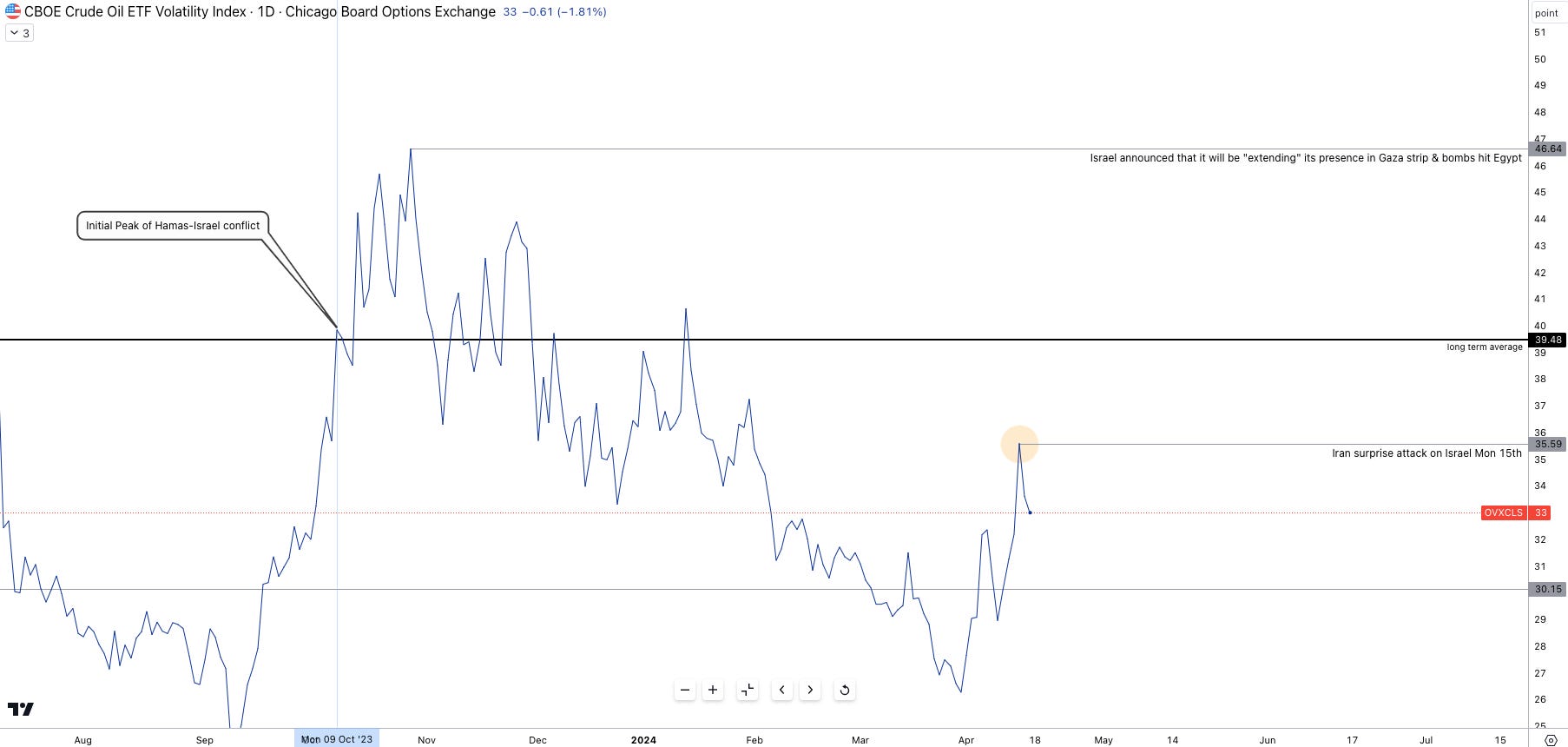
Whilst the tensions and risks of an Israeli retaliation strike to Iran’s strike over the weekend have much settled toward the end of the week, oil volatility peaked sharply on Monday open.
Brent crude is trading at $86.40 with a $4 spread with WTI Crude Oil.
The Yield Curve:
Correlations, Premiums & Convexity
In part one we broke down what a normal yield curve should look like, why the yield curve may be inverted and the different movements one may see across the yield curve.
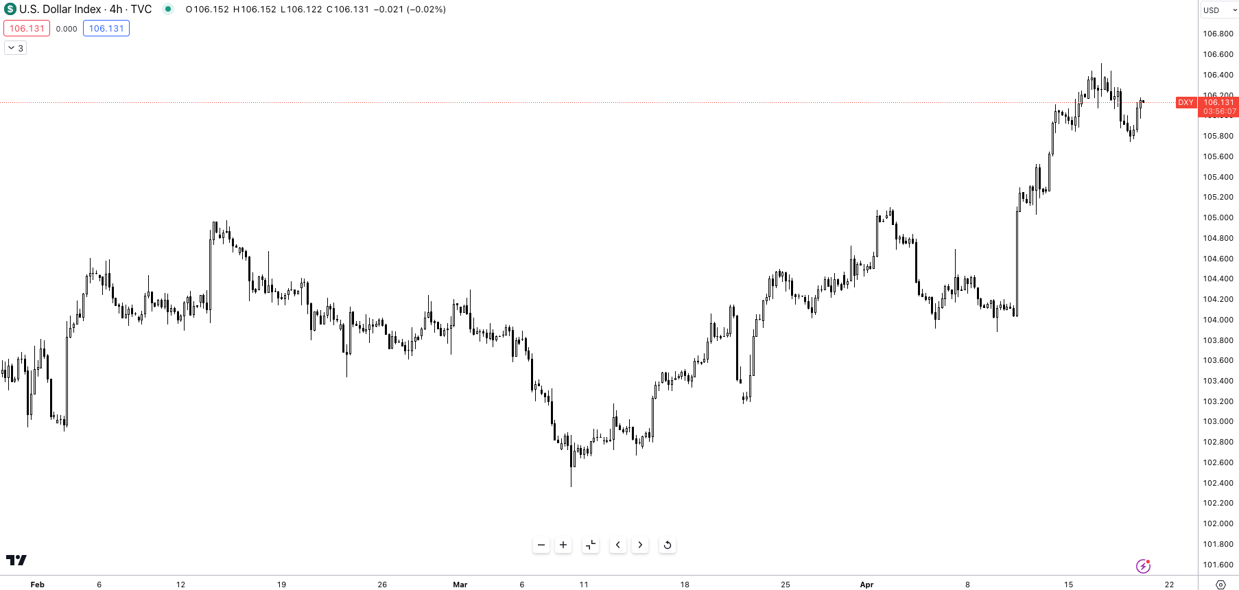
Here's a crucial factor to consider: front-end rates (those maturing within the next two years) are especially sensitive to monetary policy changes.
The 2-year rate, in particular, acts as a benchmark for market expectations of future Federal Reserve actions. This tight link explains why the 2-year Treasury yield and the US dollar index often move in tandem. Both instruments react to the same underlying force: implied changes in interest rates.
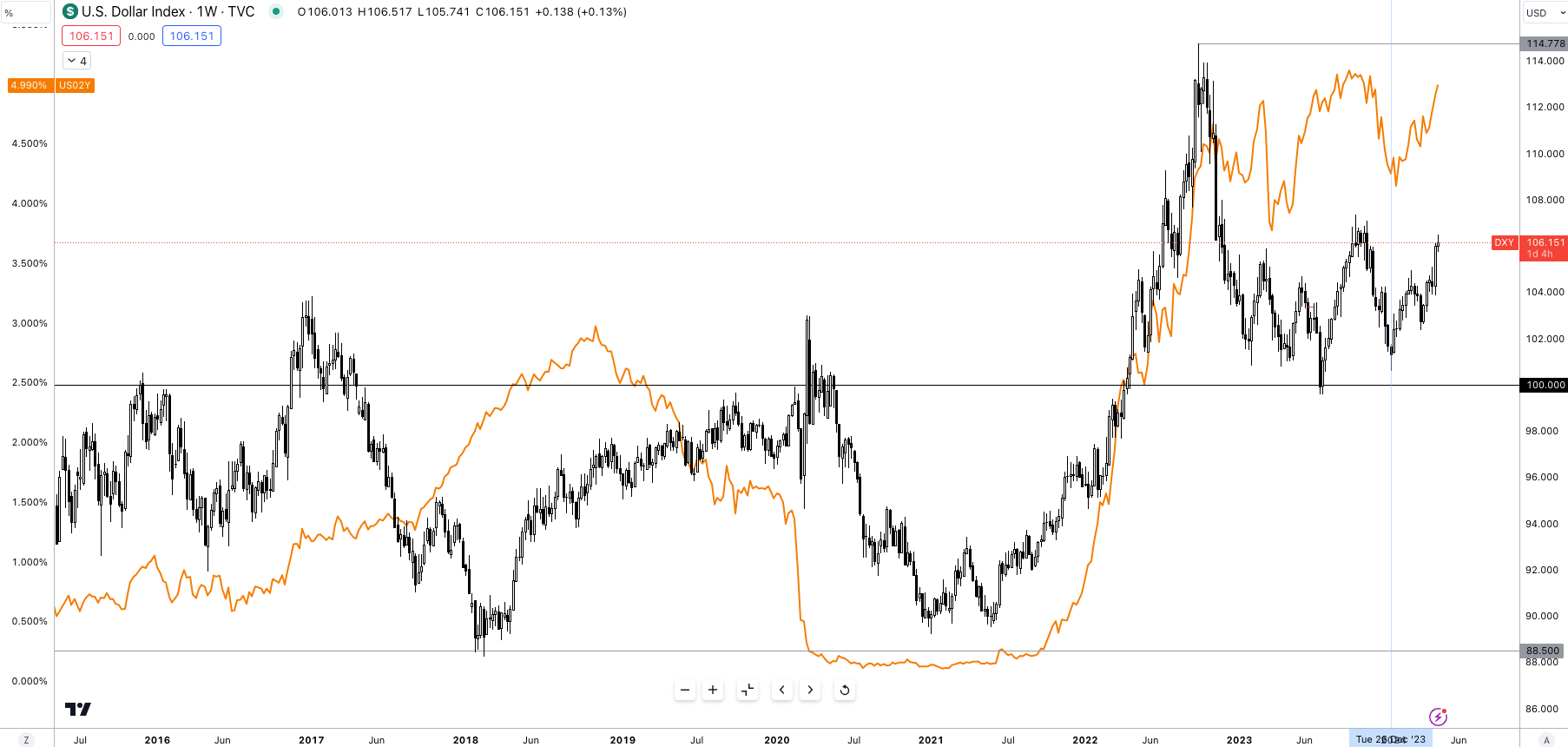
The tight relationship is exhibited in Figure 4; as is always, no correlation is 100% and as such there will be times of dislocation and times of tight correlation where a regression model would point to the correlation having a strong relationship > 0.7.
Along the front end of the curve, we tend to find the sensitivity to rate increases greater than that of the back end. Moving further along the curve (belly/back end) as the maturity of the bond increases interest rate risk increases as well; this is where we begin to explore ‘term premiums’.
As the name gives, the term premium is the additional premium demanded by investors to hold onto long term bonds compensating for the increasing risk the investor takes.
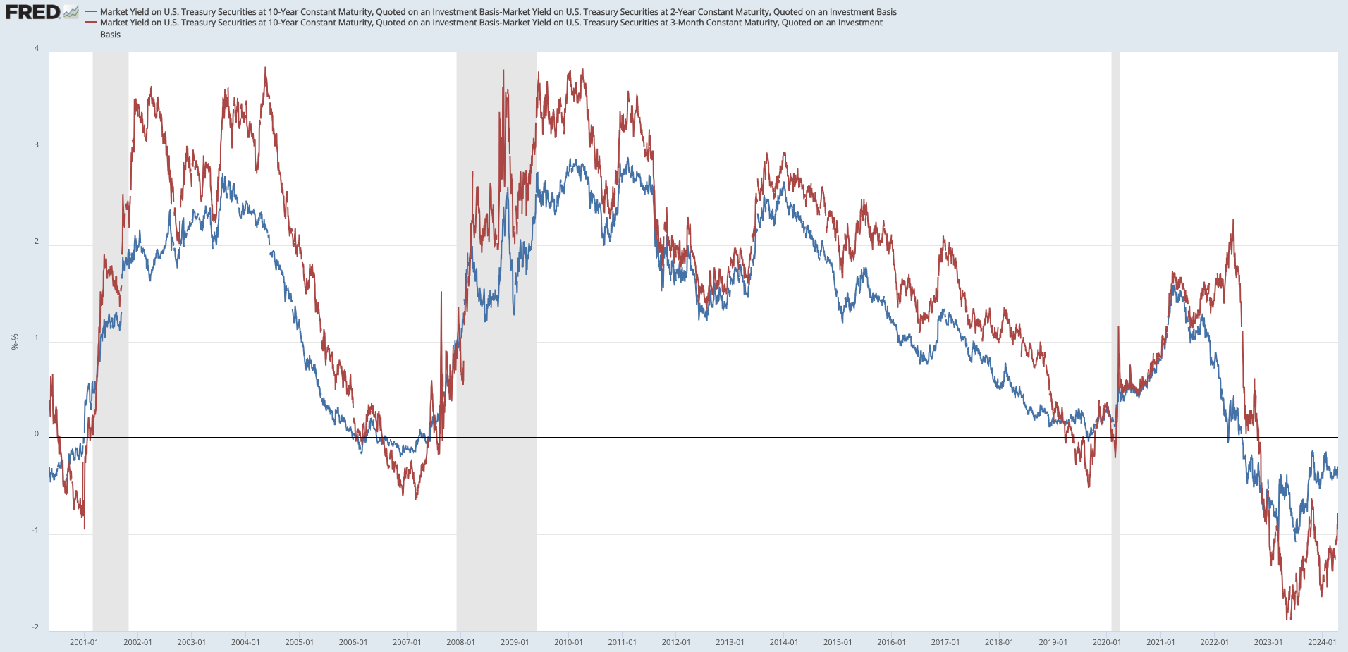
The simplest way to calculate term premium is by subtracting long rates from short rates, Figure 5 shows exactly that, with the blue line representing the 10s minus the 2s and the red line representing the 10s minus the 3m yield. As seen during the GFC a widening percentage spread shows that investors are demanding a ‘risk premia’ for taking on long term risk.
Now the most common question would be:
What happens to risk premia during inversions?
The simple answer is, that the term premia gets compressed during inversions— probably not the intellectual answer you were looking for, so let’s reframe the question. Why does term premia disappear during inversions?
It suggests a number of things regarding, (a) what investors think about the future economy and (b) what investors believe about future rates. Yield curves are known for the innate ability to predict economic downturn (most of the time), in such environments investors weigh up the available scenarios at their discretion and 95% flee to the safety of longer term bonds despite a yield inversion suppressing term premia. As such investors in such circumstances are willing to accept lower returns for the greater perceived safety of a 10y bond.
In times of market distress, making sound decisions whether you’re an asset manager or pension fund prevents you from having to testify before Congress— so, accepting a lower yield despite short rates seemingly looking attractive is what the large majority of money managers tend to do.
The compression and downtrend of term premium since the GFC is visible when revisiting Figure 5. We can credit the compression of term premia to two main factors:
Demand pressures from central banks and other inelastic purchasers of treasuries
Uncertainty about the path of short term rates
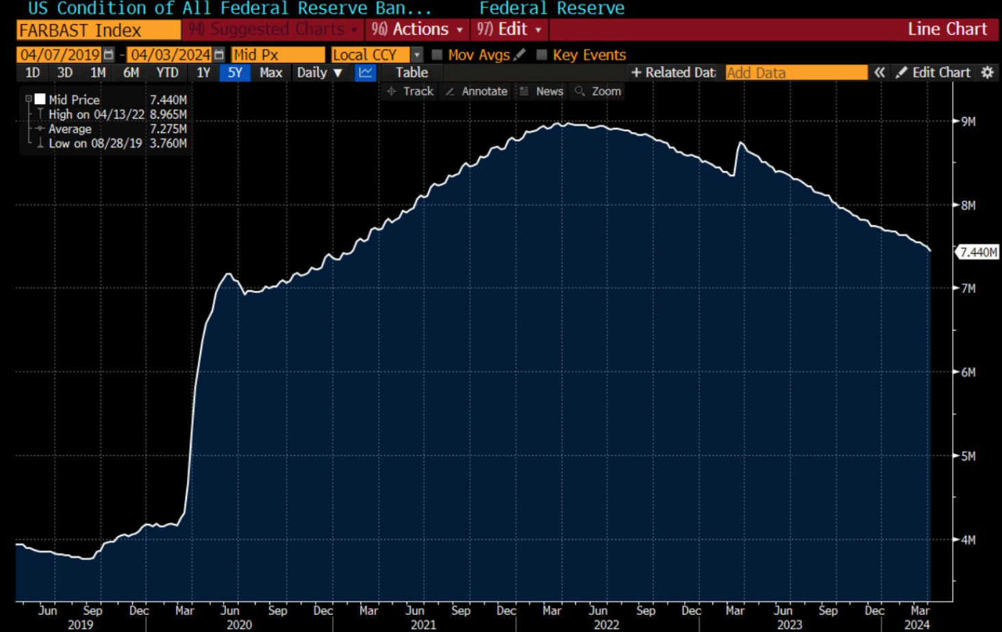
Point no.1 refers to the onset of large rises in Fed and foreign official holdings of Treasuries that have rapidly grown post-GFC. Programs such as QE, have progressively increased in size since QE1 (Nov 2009), QE2 (Nov 2010), QE3 (Sept 2012) and QE4 (Mar 2020). During QE programs the Fed becomes an inelastic purchaser of treasuries, meaning— the price swings in treasuries do not impact the scale or program of bond purchasing. As seen in Figure 6, Fed assets at their peak in 2022 swole to $8tn in assets, with a large portion being US treasury debt.
The same can be said for global central banks which have ramped up their holdings of US paper; the ultimate effect is that when large buyers enter a market, less concerned about price deviations term premia gets squeezed out due to a large layer of money being available to purchase treasuries not reflecting the true risk premia investors may have. Let’s not forget, the regulatory impact adding to the downward trend of term premia, the Basel III liquidity coverage ratio requirements have also played a role, imposing rules on the holdings of liquid assets on bank balance sheets.
Outside of demand factors weighing in on term premia, uncertainty has one effect within capital markets— a flight to safety which as you’d expect weighs in on this additional yield we’re compensated for.
So, we can now debase the trend and factors that influence term premia.
Positive Convexity
For most newbies to the world of FI, convexity is a term you’ve probably never come across— now I’m no expert on the topic of convexity so let me explain this to you as simply as I can:
Convexity is the measure of the relationship between bond prices and interest rates.
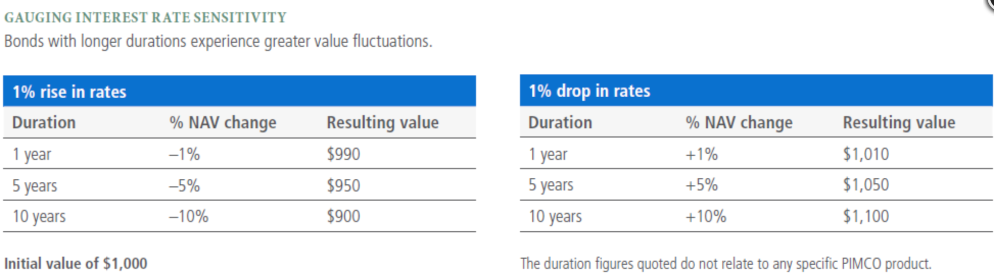
As a rule of thumb, bond prices and their yield move in opposite directions, as the price of the bond increases the yield of the bond declines. Now, duration, (a key component of convexity), measures the sensitivity of a bond’s price to changes in interest rates. For the sake of this being a primer, we’re not going to get into the math or complexities, but it’s important to know that the duration measurement takes into consideration things such as a bond’s maturity, yield and coupon.
Generally the higher a bond’s duration, the more its value will fall as interest rates rise, because when rates rise, bond value falls.
So put in layman's terms, a 1% increase in interest rates would cause the price of a bond with high duration to fall more than the price of a bond with a low duration.
So here’s where it gets interesting, if an investor thinks that rates will fall during the time the bond is held, a bond with a longer duration would be appealing because the bond’s value would increase more than comparable bonds with shorter durations.
The longer it takes for a bondholder to receive their return + principle, the higher the coupon rate.
Here’s an example to help understand:
Bond A: 10-year maturity, 5% coupon rate (fixed bond return)
Bond B: 10-year maturity, 8% coupon rate
Due to the higher coupon rate, Bond B will likely have a lower duration because the bondholder receives a larger portion of their return through regular interest payments, rather than waiting for the principal repayment at maturity.
Since the investor receives more cash flow upfront with a high coupon vs a low coupon, they receive their investment faster. This reduces the importance of the final principal repayment at maturity, which is factored into duration calculations.
As a result, the bond's price becomes less sensitive to interest rate fluctuations, (because the large % of payments were made early in the bond’s life) leading to a shorter duration.
I hope that brief example helps you understand duration better.
So, here’s how duration and convexity work together in a rather decent analogy.
Imagine the yield curve as a bridge. Duration tells you the slope of the bridge, (a steeper slope means higher sensitivity to rate changes, i.e. lower coupon rate). Convexity tells you how curved the bridge is. So, the higher the convexity, the greater the price change per 1% rise/fall in interest rates.


The yield curves you see above show positive convexity.
This is how the curvature benefits us:
Price increase acceleration: As interest rates decrease (good for our bonds), the price increase accelerates. This means that our bond price goes up by a larger amount than it would with a straight-line relationship. E.g, if I long the 10y I am long convexity, and because of this I would make more when rates decline a certain amount, say 30bps than I would lose if rates were to go up 30bps, the same amount.
So we benefit from prices rising faster and from the prices decreasing slower due to convexity.
It may take you going through this report a few times to really grasp all the contents, trust me, I need to read something over and over again before I truly get the information down.
In the next series, I’ll explore what we’ve learnt and introduce trade ideas that we could explore with our newfound basic knowledge of bonds.
As for now, thanks for getting through the report.
Another interesting read Joe!. how would you interpret investing opportunities in an up warding sloping YC environment? frontend would have lower rates & back end long duration (YTM) which are factors that should increase bond convexity.