
The Macro Data That Matters

U.S Labour Market Still Kicking, For Now…
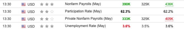
In this piece, I’m going to explore the macro pieces of data that really matter, but before we get into that, let’s take a look at U.S non-farm data. Yesterday we had a massive beat on employment, about 65,000 + expectations, showing that for the month of May the U.S labour market was able to maintain its tightness. The participation rate, which measures the percentage of employers that participate in the readings, was also up for the month. The unemployment rate still sits at 3.6%, which emphasises the strength of the U.S labour market.
Now, on the other hand, one must bear in mind that in the world of macro releases there are two types of data. Leading data and lagging data. Surveys are leading indicators whilst hard data shows lagging data, i.e NFP for May, Gdp figures YoY. Surveys are about current sentiment rather than ‘reality’ examples would include PMI. and ISM. Hard data as I mentioned include releases such as CPI, retail sales figures + home sales.
Back to my point on the labour market, currently, we’re seeing a robust climate that is poised to weaken as the Fed ramp up quantitative tightening from June; as interest rates increase fulfiling analysts’ prophecy of ‘market normalisation’ this is bound to have an effect on tech firms reliant on ease of access to credit, something I spoke about in my last article.
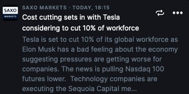
Tesla is just one of many firms in the Nasdaq that are slashing away jobs to free up cash flow as we go into a deeper place within the markets. So what does that mean exactly? For the upcoming months, I’m fairly bearish on unemployment data, meaning the figure we’re seeing will be the lows for a while. This is a clear easy prediction for one to make when looking at the alignment of data and the Fed’s monetary policy stance.
The ECB & The Path Ahead
As it stands the ECB have its rates sitting in negative territory (50bps); however with the amounting pressure to preserve its credibility (their biggest concern) they have shifted towards a hawkish stance in order to battle 8.1% inflation. Early on Thursday, ECB Chief Economist Philip Lane spelt out forward guidance to the public on the bank’s policy plans pointing at a 25bps hike in July followed by another 25bps in September. This is also in line with the ECB’s planned halt of their asset purchase program (stimulus) or PEPP.

This Chart here presents why the ECB has got a sticky job on their hand hiking rate. In the Philip R. Lane: Inflation shocks and monetary policy report the main contributor to their inflation shocks was attributed to; pandemic cycles, which caused shutdowns leading to bottlenecks that bled into ECB’s balance sheet in hopes of propping the economy up. An energy shock, mainly supply disruptions caused by Russia-Ukraine. I could go on and on, you get the point.
The expectation for the ECB rate hikes points towards 100bps for the remainder of the year taking their rates into positive territory. This should further support the euro avoiding a parity move against the dollar.
The Neutral Rate For The ECB
As it stands the neutral rate for the ECB is between 1-2%. If you’re thinking what is the neutral rate? Let me explain that for you. The concept of a neutral interest rate is used to describe the stance of monetary policy. If policy rates are below the neutral level, let’s say 2% and rates are at 1.75%, monetary policy is accommodative and if they are above, the policy is restrictive. This neutral rate is defined as the rate where full employment consists, where an economy is growing at full potential with no output gap and stable price growth. An economy in this environment wouldn’t need to be stimulated or slowed by monetary policy.
So now hopefully you understand that what really constitutes to an aggressive monetary policy stance isn’t the just size of the hike, it’s how much higher the rates are above the neutral interest rate.
The Macro Data That Matters
Now we’re here. On top of what you already know about macro data, there are a few things I thought would be valuable for you to keep in mind going forward.
Firstly, understanding the importance but also the weight behind hard and soft data (surveys). Right now everyone is focusing all their attention on the inflation data, but that is all lagging pieces of evidence, not forward-looking insights. That can easily lead to incorrect interpretation of where markets are headed and policy expectations.
There’s one heavily overlooked survey to which I pay quite a bit of attention to. ISM readings. With a correlation near or even over 80% this index is the best indicator of the U.S economy. As figures begin to contract and drop, that usually seeps into equities as well.
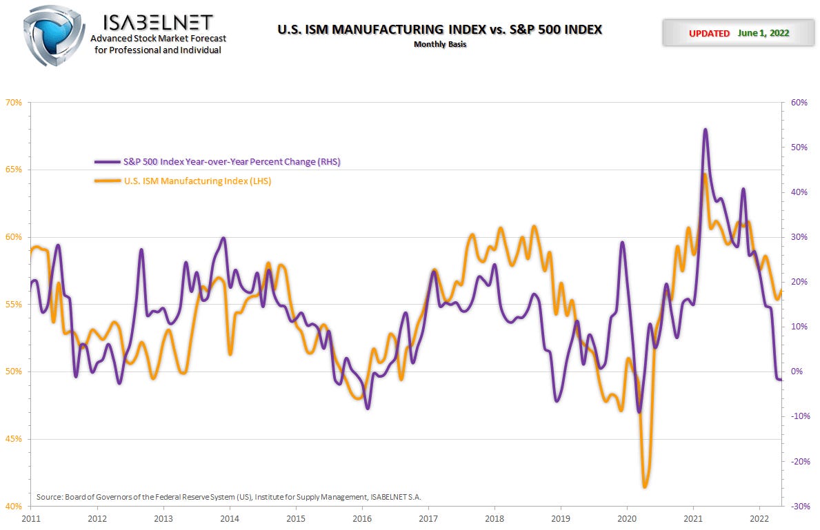
For those who aren’t aware, the higher ISM compared to 50 the greater indication of a growing economy and vice versa for below the 50 mark. So far we have been in a period of expansion so the ISM reading has managed to stay above 50, but looking overseas at China, a great proxy for global growth/cycles, they have dropped to levels not seen since the peak of Covid, which tells me that ISM could soon start painting a similar picture for the U.S.
Thanks for getting to the end of my article! Today’s piece was a bit longer than usual but hopefully delivered some value to you.
If it did, I would appreciate you forwarding this to friends/market addicts and sharing it on social media to grow our platform! Costs nothing but means everything!