
Macro lesson 2: FX Correlations, Narratives
Pt.2 of our lesson from last week exploring how you can build a macro narrative

Hey crew,
We’re back with the second lesson following on from lesson one where we explored:
The mental framework professional investors and traders use.
What is a macro narrative and how to develop one.
Reviewing different narratives.
The dollar smile theory.

Anyways, today we’re going to spend some time exploring correlations in the FX market, but wider than just FX, we’ll look at how yields influence equities, commodities, how equities correlate with its country’s currency, commodities and much more.
As always, lend me your attention.
The Numbers Behind Market Correlations!
Yes.
A topic which I know all of us have been waiting for; as a matter of fact, I can remember early in my trading career studying the market trying to figure out what correlations were true, and the data behind them so that I wouldn’t just be following an old market myth or tale.
The truth is a simple as the quote below:
“Regardless if you’re a day trader in your bedroom, or a PM at a big blue chip buy side firm, if we can understand what’s driving price right here right now, we can have a better edge predicting price tomorrow”— Huw Roberts
Rolling 100/30 day correlation heatmap
I recently came across this correlation heatmap built by FXMacroGuy which was spectacular in depicting the correlation between different currencies and their yields, VIX, MOVE, IG credit (investment grade) and even 10y BE's (break even's).
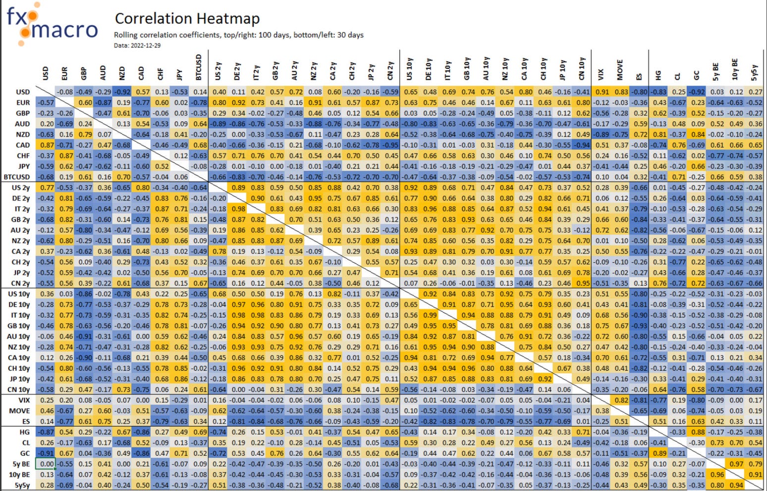
Highly recommend checking him out and his material, exceptional research.
To understand this heatmap it’s worth mentioning the values go from -1 to 1, the higher the figure to 1, the tighter the direct and positive correlation, and the closer the figure to -1 the stronger the inverse correlation between the two assets.
The top right half of the heatmap represents the 100 day rolling correlation and the bottom left is a 30 day rolling correlation. Now this data is dated to Dec ‘22 but it’s safe to say there world of correlations haven’t done a complete U-turn over that period.
What stood out to me and what you can take away:
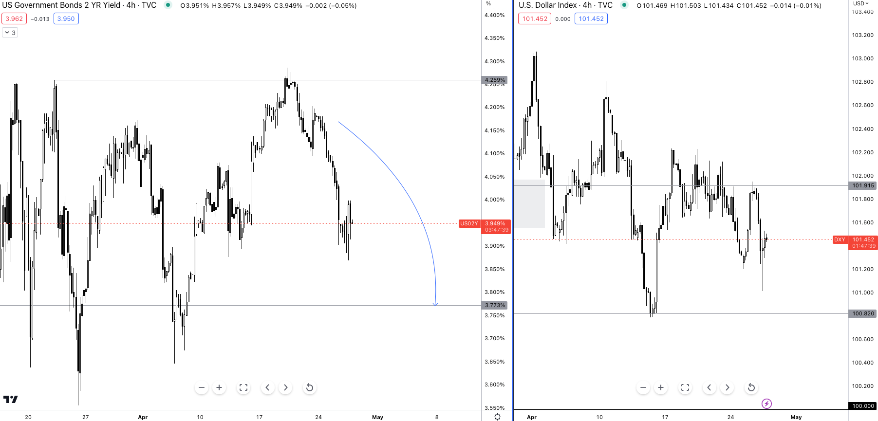
starting out with the dollar, the USD shows a strong short-term correlation with it’s 2s, something I have stressed on for some time in recent posts with my recent analysis from Friday below.
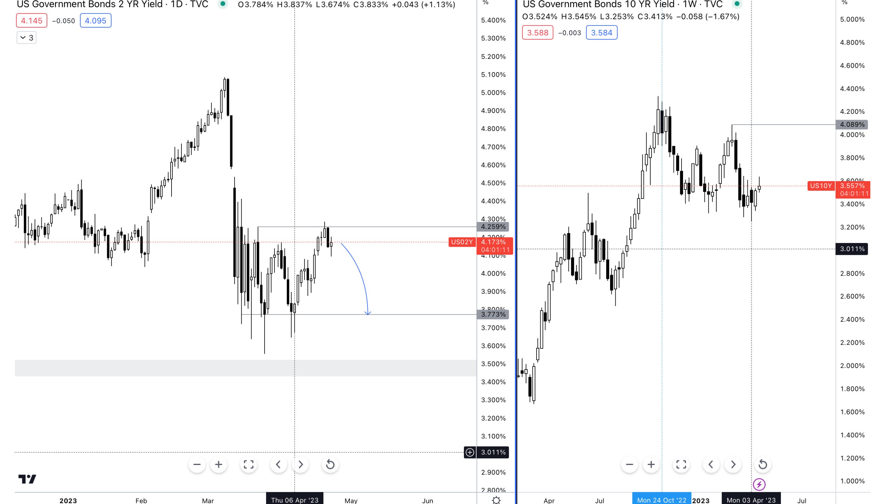
vs today.
Now what does this mean and how can we benefit from understanding this correlation?
It’s simple, if I know my view on the 2Y is bearish based on my analysis of the Fed and where we are within the tightening cycle (nearing the end), as well as where the U.S economy is positioned within global dynamics and which business cycle we’re in, the regime we’re entering then I can tie my understanding of the 2s correlation with the dollar and either short the 2s through an ETF instrument or short the dollar using an ETF instrument as well. Now, those wouldn’t be the only two ways to represent my bearish outlook on the U.S economy and the currency, we can also explore a proxy trade which would represent my bearish view of the 2s and the dollar by looking at what instrument has a highly negative correlation to the dollar and 2s?
Well.
One thing, or shall I say one commodity stands out against the dollar, not so much the 2s (2s meaning US2Y bond), and that would be HG, an abbreviation for High-Grade Copper.
Observe the high negative correlation between the USD and HG, the rolling 30-day correlation is -0.87 and the rolling 100 day correlation is -0.83.
Here’s the other side of that scale, now that we know what negatively correlates with copper we can look at the heatmap and the chart below to understand what drives copper.
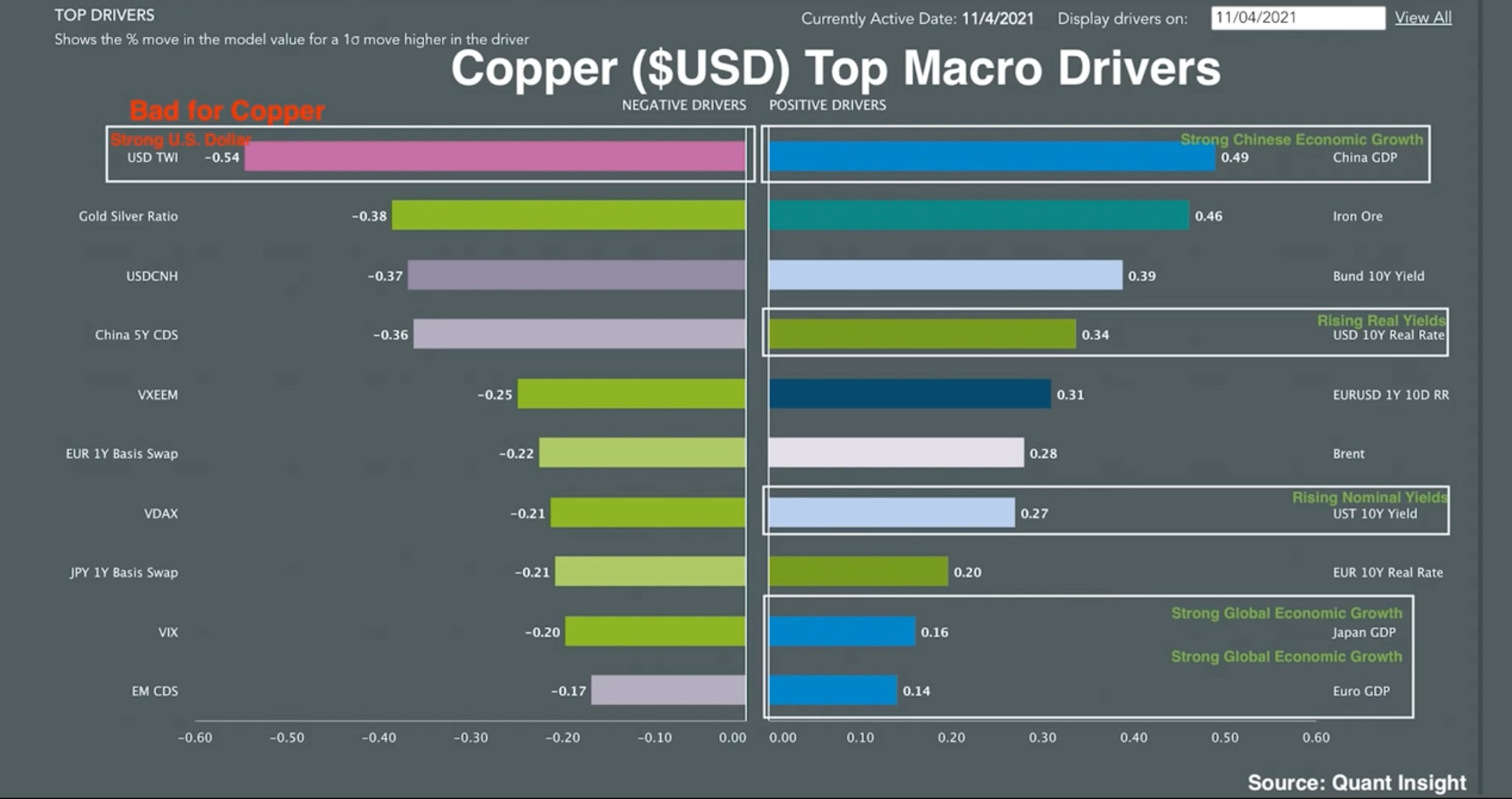
For those who are really intrigued, this is a regression model to judge the correlation.
The positive boosters for copper would be strong Chinese economic growth as seen on the right hand side, upside increase in iron ore price as well, rising real yields, meaning investors are either becoming more optimistic about economic growth or becoming concerned about the future of inflation. 2020-21 was an example where real rates would’ve been soaring due to the increased expectation of higher inflation amidst a strong rebound in growth.
We can also see that strong global economic growth particularly in Japan and Europe all weigh in as positive macro drivers for Copper.
So, if I’m short on the DXY, copper longs would be a trade idea IF the above macro conditions were to be in play, but as we’re entering a period of slower economic growth with IMF WEO projections pointing to deceleration in global growth and real yields flattening, copper longs wouldn’t deliver substantial alpha for the relative risk.
Looking back we can see the relationship between rising real yields and copper price during the period of 2020-22.
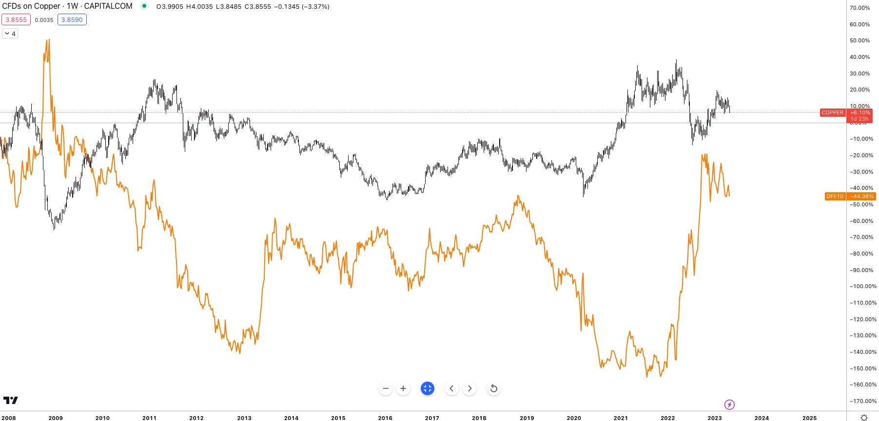
It is worth noting that the regression model which was built based on market data up until April 2021 has a greater correlation vs the correlation heatmap I first shared, this is perfectly normal. Certain correlations may fall in and out of regime due to numerous factors but one can clearly see the relative alikeness in copper’s movement with real yields.
So in this particular, scenario going short the UUP ETF (Dollar ETF) would be my best option to present this idea, different brokers may have different names for the dollar ETF. FYI I have to say this isn’t investment advice for regulatory purposes, purely expressing my personal views and decision making.
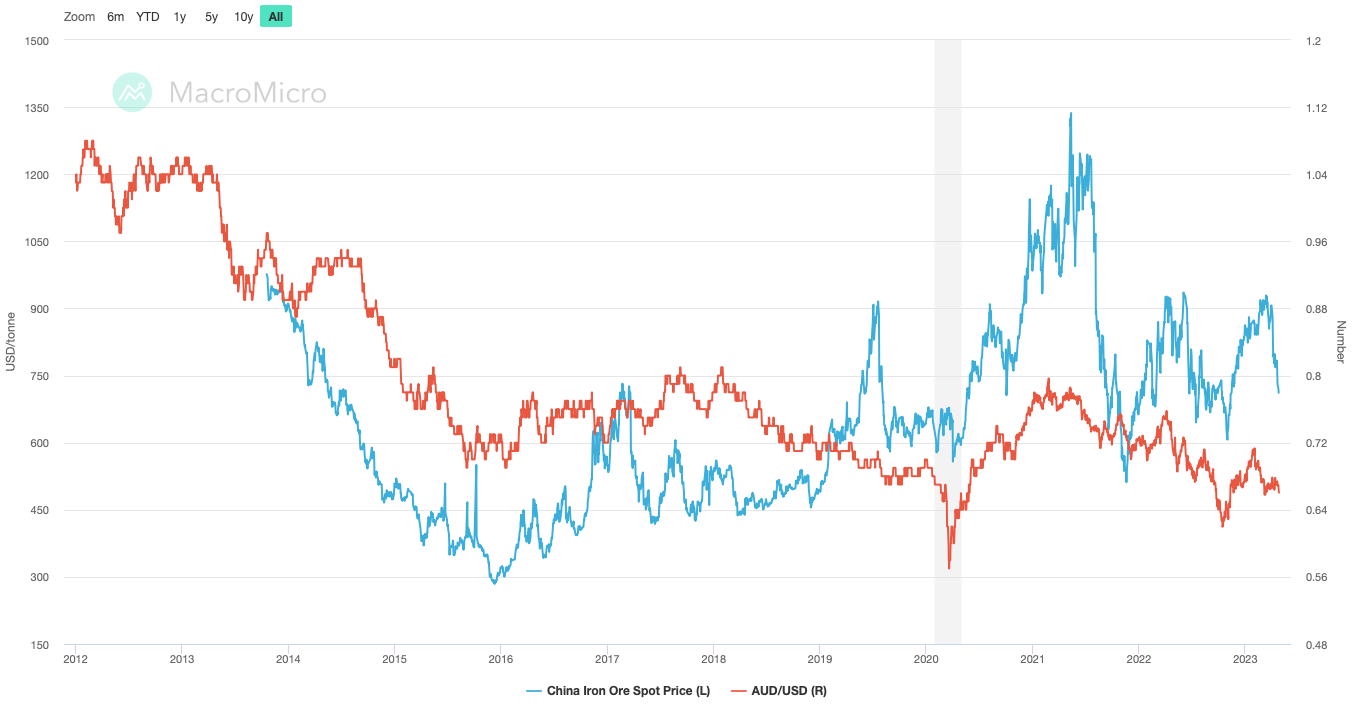
In line with commodities taking a look at the correlation between iron ore and the Australian dollar is another inevitable correlation.
A synopsis of the correlation above is simple.
Australia is the world’s largest exporter of Iron Ore, accounting for c40% of Australia’s exports. So here’s the link, as the price for iron ore increases due to supply/demand factors or an increased global consumption driven by non-other than China, the world’s largest consumer of iron ore, the price of iron drives higher. As Australia is the key to the iron ore world countries have to purchase AUD in order to pay for their iron ore orders driving up demand for the Aussie, due to the tight link between higher-risk, higher yielding commodities and EM currencies as a whole, the Aussie is deemed a risk-on currency.
So when risk is on, and investors risk appetite is increasing, the rate environment is relatively under control and EM begins to become a destination for resumed investment, a proxy trade would be to long the Aussie against the greenback since the Aud acts as a resemblance of EM currencies due to it’s reliance on commodities, something many EM currencies rely on.
But what else could be seen as a proxy trade for this correlation?
The below chart is the rolling 100/30 day correlation between currencies, yields, stocks and more— this is a recent correlation heatmap dated to this month.
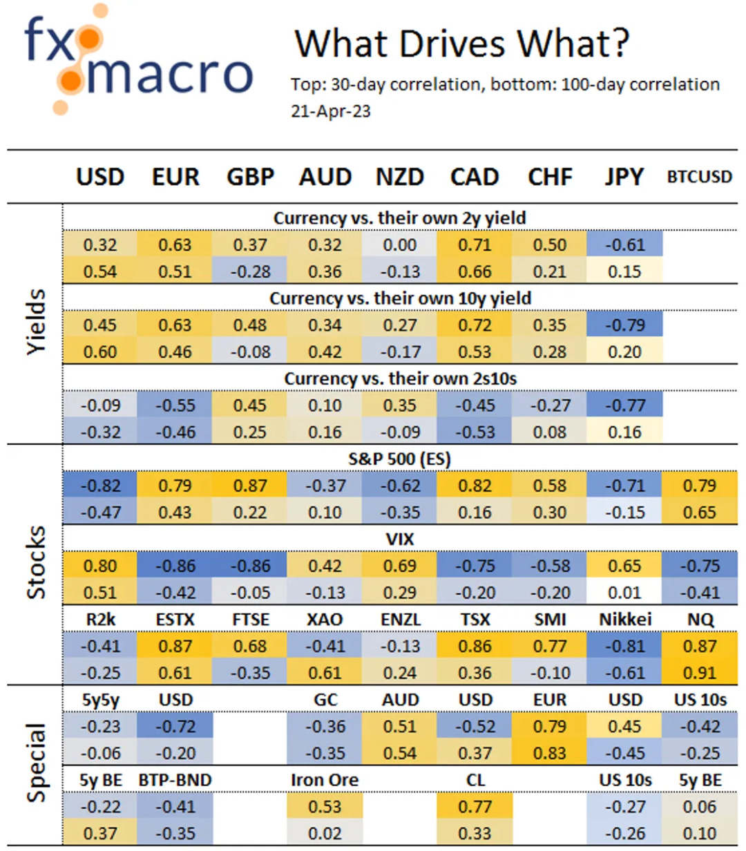
Other than Iron ore we can see that a proxy of being long Aussie would fall into the XAO which is the benchmark stock index for the Australian Securities Exchange with a correlation of 0.61.
Quick note, if you’re wondering what 5y BE’s are and BTP-BND here’s a brief explanation.
The 5y BE is simple the 5-year break even rate, which is the projected inflation for 5 years, and that’s calculated by subtracting the yield on a nominal 5-year treasury bond, and the yield of a 5-year inflation adjusted treasury. So, “the 5y BE implies what market participants expect inflation to be in the next 5 years, on average.”” — FRED St Louis Fed
Lastly BTB BND’s are widely renowned as Germany’s bond market which serve as a benchmark across Europe due to it’s size and liquidity topping any other in Europe.
That rounds up today’s macro report covering FX correlations, and branching off into proxy trades.
There’s still a lot more to uncover about correlations, so I’ll be building my own excel screen dashboard to go further into this.
I’ll catch up with you guys in the discord!